Visiting a large number of websites and blogs has given me a different perspective on the finer details of the images and text that appears on my monitor. I totally believe in the freedom to be different and in expressing individuality, but not at the cost of driving away potential readers. Unless, of course, the goal is not to have any followers or users of your site.
Let’s talk about something that is immediately identifiable and either makes or breaks a blog for me.
Font.
Maybe you’re scratching your head and thinking, “Why is The Redhead Riter going to teach us about a basin for holding baptismal water in a church?”
I’m not “riting” about baptismal fonts! A font is also a specific size and style of type within a type family.

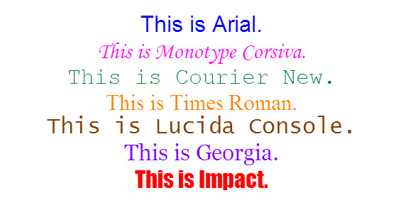
What do you notice about the above fonts?
Did you say font type?
Well, you’re right, but is that all you noticed?
Yes! Right again! Each has a different color and appears to have a different size.
They do have a different color, but they are all size 24 px which stands for pixels. A pixel is just a unit of measure. The “x” in the word below illustrates each pixel or square that makes up the letter. In the example, the “x” is 9 pixels high. It is not true to font size, but illustrates my point.

Sizing fonts with pixels is very accurate because you are telling the computer the exact number of pixels (little squares) high that you want your text letters. It is also my most favorite method of sizing text because it has less variation than other methods.
Think of it like shopping for a man’s dress shirt. Men can buy a shirt that is sized: “16-34/35” which says that the neck is 16 inches and the sleeves fit 34 and 35 inches or “Large” which means it is bigger than medium and smaller than extra large. Obviously, one method is more exact than the other. Also remember, just because you wear petite, doesn’t mean everyone can fit in your dress. Translated means, make the font large enough to read for the masses.
It is best to keep the font style simple so that it can be easily read by the viewer and varying monitor resolutions. Basic fonts such as Arial, Gills Sans, Helvetica, Sans Serif and Lucida are very popular because they are simple and can be translated from the screen with ease.
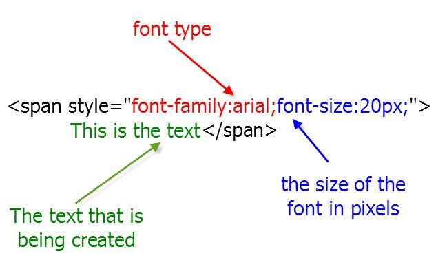
“This is text” with letters 20 pixels high in Arial font has HTML coding that looks like this:

Do you understand pixels and fonts now? Last week we learned about pictures.. Do you remember the message?
As always, attached is the weekly Linky to enter either the main URL to your site or add each post you publish throughout the week.
Until next week’s wooing post, enjoy your blog, and enjoy using pixels!
Properly Pixelated,


How brilliant! I prefer to keep my font simple to be honest. Am I listed on the blogrolls, I don't know!
Best wishes, CJ xx
Thank you for writing this. I have a really hard time reading blogs that use a small font size. It is one of my pet peeves! I've added a command to my post template to make sure the font on each post is big.
I try to keep things simple. I've quickly learned that if I try to get fancy I start screwing everything up and begin cursing the computer even though I really know it is the operator. A little knowledge is a dangerous thing. For expert knowledge, I turn to you.
Now I'm going back to read the 'pictures' entry.
This is a great little write up – I always wanted my font to appear normal and draw emphasis with large fonts, but I wish there was something in between normal and large…I'll play around with it.
BTW, I thought I was following you but apparently I was not. Now I am.
Me too I like the simple fonts. It shows simple and easy to read. Great post you have! Thanks for sharing.
I love your how to and why posts. I know my blog needs work. As soon as my current crisis passes I plan to work on it.
Jules @ Trying To Get Over The Rainbow
thanks for the post Red! I generally like to use a simple font, but occasionally like to play with a few words to accentuate or even a splash of color on a word or two here and there – hehe
I am going to have to try it. I hate the default font I use, but especially the size.
Thanks!
Great way to explain pixels. :O)
I really know it is the operator. A little knowledge is a dangerous thing. For expert knowledge, I turn to you, thanx.
WOW! It shows simple and easy to read. Great post you have! Thanks for sharing.